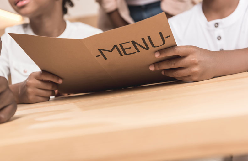
Your restaurant could have the best food around, but if the menu doesn’t reflect that your customers may be disappointed before they’ve even taken their first bites. Every element of the menu makes an impression on your diners, from the type of paper it’s printed on, size of the menu, typeface used, color palette, pricing and more.
Less is more
Some restaurants, particularly diners, pride themselves on the wide variety of their menu offerings. However, you might want to refer to the “paradox of choice,” a psychological theory that says that the number of options a person is given is directly proportional to his or her anxiety level. Which leads us to the “golden number”: no more than seven options per food category.
Size matters
Just as the number of menu items can be daunting, so can an oversized menu. Large menus can be unwieldy to handle, especially with tall water and/or wine glasses on the table.
However, be careful about menus that are so small they can’t be read. If your restaurant opts for romantic candlelight, you’ll need a font style and size that’s easier to read. Fancy lettering may work for category headings, but for actual descriptions stick with a simple typeface.
Which palette for the palate?
Colors also play a part when it comes to menu design. Certain colors can stimulate the appetite, while others can do the opposite.
Red is one of the most appetizing colors. It also creates excitement, which is why some restaurants reserve this color for the menu items with the highest profit margins.
Orange and yellow are bright, “happy” colors that can stimulate the appetite. They also can draw the eye to an area of the menu.
On the other hand, black and purple are less appetizing colors. And stay away from blue, which can suppress the appetite.
Green is a popular color, because it is associated with clean eating and healthy food. It also implies that the food is fresh.
Go high-tech
Some restaurants and bars are skipping the printed menu altogether in favor of a digital version. Presenting your menu on a tablet gives you the freedom to change it up for seasonal items and special occasions, without incurring printing charges.
Seeing is believing
While food imagery can whet the appetite, you don’t want to overdo it. One photograph per category (appetizers, soups, salads, entrees) may be enough. For a more whimsical approach, consider illustrations to engage your customers.
And if your restaurant is high end, you may want to forego photographs altogether. Think of menus at the finest restaurants; they let the descriptions create a visual impression of each item.
Of course, when it comes to desserts you may want to show what you’ve got. In the case of a visually appealing dessert, such as a molten lava cake, showing both the cake’s exterior and interior is an irresistible combination.
Pay attention to price
Don’t scare away your customers by over-emphasizing the prices. In fact, lose the dollar signs completely. If you adequately describe your culinary creations, then the price won’t be as much of an issue for your customers.

